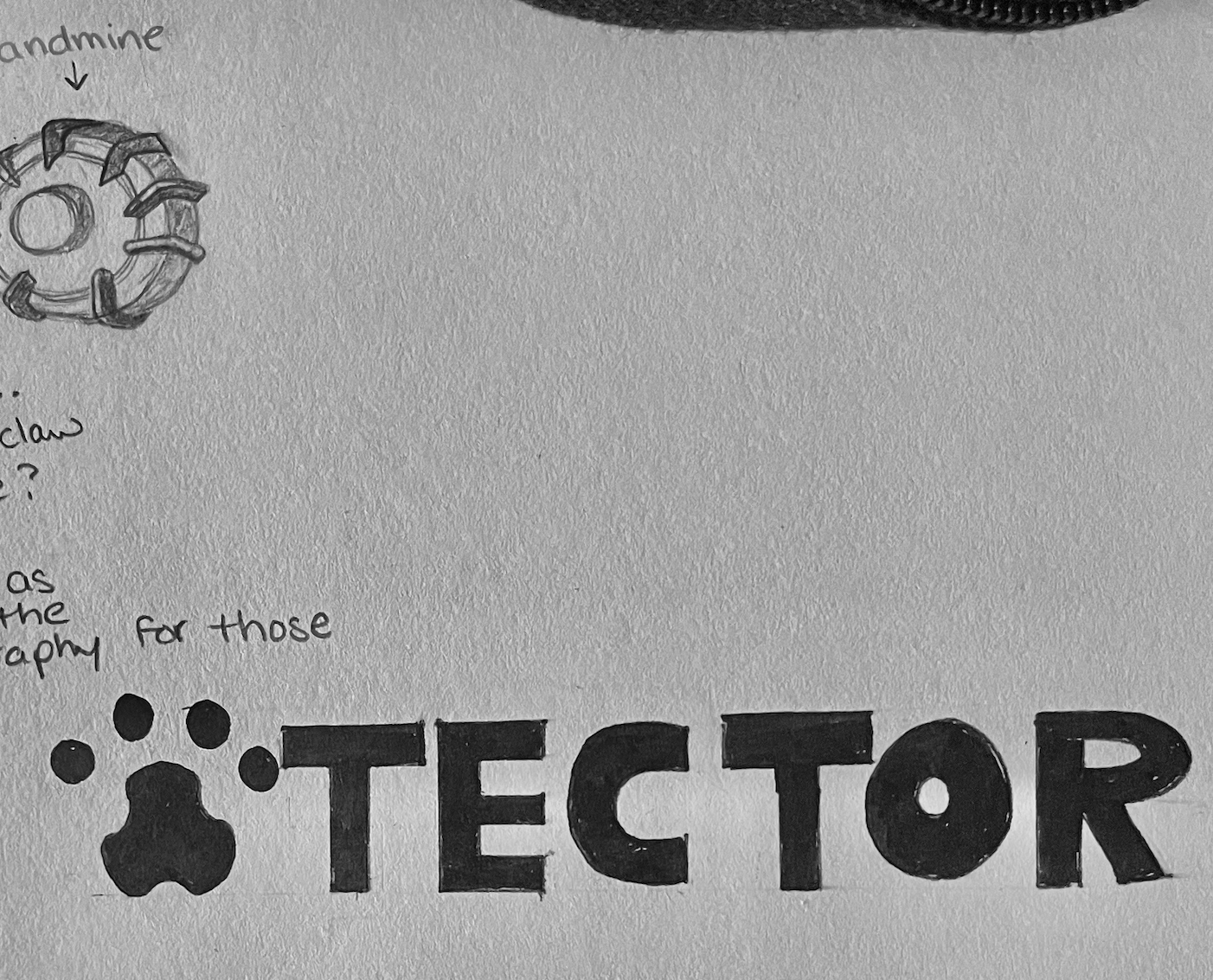
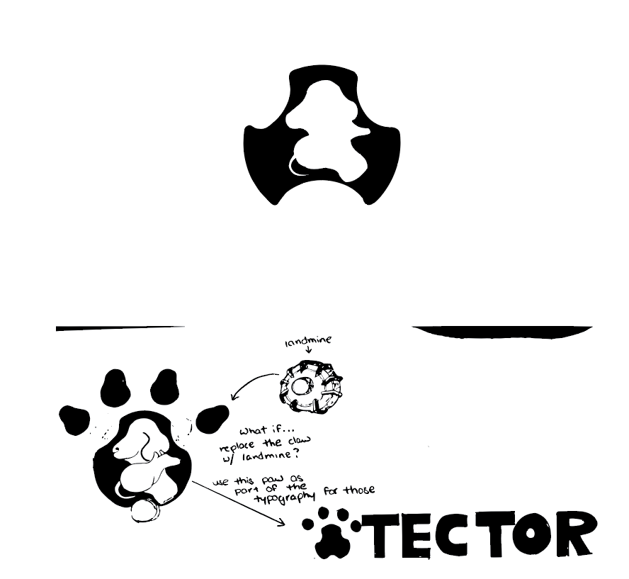
Logo Redesign
This project focuses on redesigning the logo for the HeroRATs initiative by APOPO. The goal was to create a refined and modern visual identity that reflects the organization’s mission of using trained rats to save lives. Through simplified forms, improved typography, and thoughtful composition, the redesigning logo enhance clarity, impact, and recognizability while staying true to the original purpose and message.
Year
2024
Tech
Illustrator
Overview
This project focused on redesigning an existing logo to improve clarity, modern appeal, and brand consistency. The goal was to create a more recognizable and scalable identity while preserving the brand’s core message.
Problem
The original logo lacked visual hierarchy, scalability, and modern relevance, making it less effective across digital and print platforms.
Design Approach
Simplified the logo for better readability and scalability
Refined typography for a more modern and cohesive look
Improved visual balance and alignment
Ensured versatility across multiple platforms (web, mobile, print)
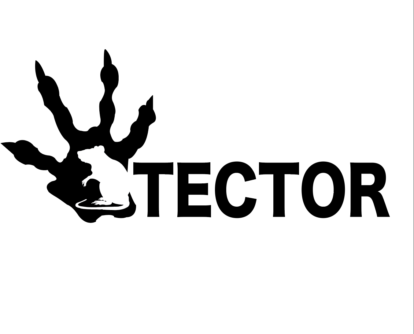
Outcome
The redesigned logo is cleaner, more recognizable, and adaptable across different use cases, strengthening overall brand identity and usability.